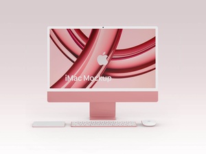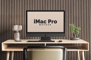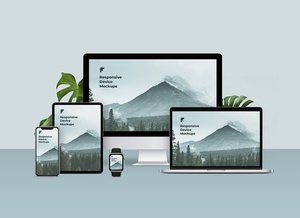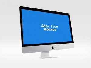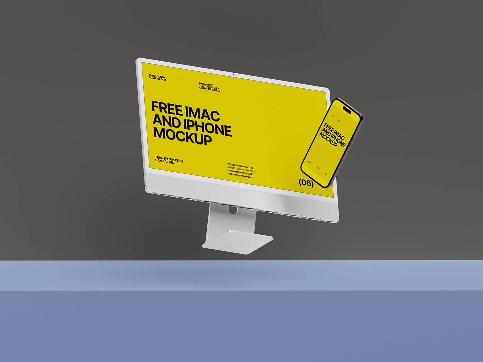






iMac & iPhone Pro Responsive Website Mockup

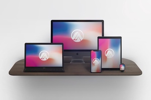
The trend towards larger screens, particularly in televisions where smaller sizes are becoming increasingly rare (typically starting at 42 inches and reaching up to 98 inches), has significantly influenced application, UI, and web design. This surge in screen real estate has fueled the adoption of responsive design principles.
Responsive design allows interfaces to dynamically adapt to various screen sizes, ensuring a consistent and optimal user experience regardless of the device. This adaptability is achieved through the implementation of fixed incremental ratios for UI elements. As the screen shrinks, all elements, including text, proportionally contract and resize, maintaining visual harmony. This technique is widely employed across both web and UI design disciplines.
However, special attention must be paid to image handling in responsive designs. Scalable Vector Graphics (SVGs) are often the preferred choice, as they can seamlessly expand without any loss of quality. In scenarios where raster imagery is unavoidable, such as when showcasing physical product photos, the WebP format is highly recommended. WebP offers superior compression capabilities, leading to reduced image sizes, particularly beneficial for animated images. Furthermore, larger, higher-resolution images can be selectively loaded on bigger screens to maximize visual fidelity.
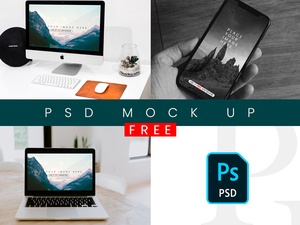
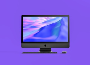
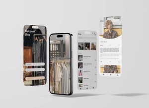
To aid designers in visualizing their responsive creations, we are offering a high-resolution iMac & iPhone Pro responsive website mockup in PSD format. This layered PSD file allows for easy insertion of your artwork via smart objects, providing a realistic and polished presentation.
Details:
- Format: Layered PSD with Smart Object Insertion
- License: Free for personal and commercial use
- Zip File Includes: Photoshop PSD File(s)
- Mockup Resolution: 8000 x 5500 px
Instructions:
- Simply place your designs onto the designated smart object layers.
- Requires Adobe Photoshop CS5 or later.