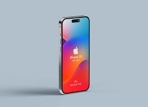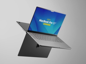


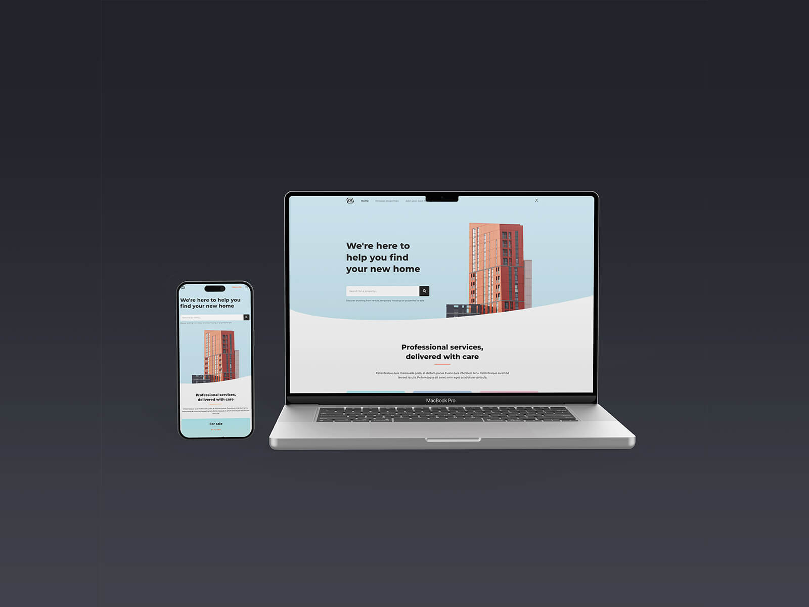
iPhone & MacBook 2024 Web Design Mockup
Mobile-First Web Design: Embracing the Future of Internet Browsing
In today's digital landscape, mobile devices have become ubiquitous, transforming the way we access and consume information online. This surge in mobile usage has led to a paradigm shift in web design, emphasizing the importance of creating websites that prioritize the mobile experience.
The Power of Mobile-First Design
Mobile-first web design is a design approach that places the mobile user experience at the forefront of the development process. This approach involves designing and developing websites that are specifically tailored to the smaller screens and unique capabilities of smartphones and tablets.
Key Benefits of Mobile-First Design
-
Enhanced User Experience: Mobile-first design ensures that users have a seamless and enjoyable experience when browsing your website on their mobile devices. A well-designed mobile website is easy to navigate, loads quickly, and provides content that is easily readable and accessible on a small screen.
-
Search Engine Optimization: Google and other search engines prioritize websites that offer a good mobile experience. By adopting a mobile-first approach, you can improve your website's ranking in search results and attract more mobile users to your site.
-
Increased Conversion Rates: A mobile-friendly website is more likely to convert visitors into customers. When users have a positive experience on your mobile site, they are more likely to make a purchase or take the desired action you want them to take.
Introducing the iPhone & MacBook 2024 Web Design Mockup
To help you create stunning mobile-first website designs, we are excited to present the iPhone & MacBook 2024 Web Design Mockup in PSD format. This mockup allows you to showcase your web designs in a realistic and professional manner.
Features of the iPhone & MacBook 2024 Web Design Mockup:
-
Layered PSD: The mockup comes as a layered PSD file, providing you with flexibility and control over the design elements. You can easily insert your artwork into the smart objects and change the background color to match your brand identity.
-
High Resolution: The mockup is available in high resolution (5000 x 5000 px), ensuring that your designs look crisp and detailed. This makes it ideal for presenting your work to clients or showcasing your portfolio.
-
Easy to Use: The mockup is incredibly user-friendly. Simply place your web design on the smart layer, save the file, and you're done. It's that easy!
Download and License Information:
You can download the iPhone & MacBook 2024 Web Design Mockup for free and use it for both personal and commercial projects. The zip file includes three Photoshop PSDs, allowing you to create multiple mockups with different designs.
Instructions:
To use the mockup, follow these simple steps:
-
Open the Photoshop PSD file in Adobe Photoshop CS5 or later versions.
-
Double-click on the smart layer and place your web design.
-
Save the file and your design will be automatically updated in the mockup.
Embrace the Mobile-First Approach
In conclusion, mobile-first web design is the key to creating websites that thrive in the mobile-centric world we live in. By prioritizing the mobile experience, you can create websites that are accessible, engaging, and effective in driving conversions. The iPhone & MacBook 2024 Web Design Mockup provides you with the tools you need to showcase your mobile-first designs in a professional and visually appealing manner. Embrace the mobile-first approach and take your website to the next level.