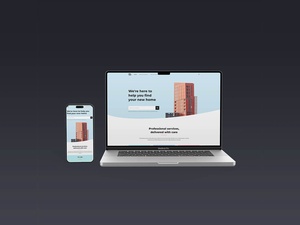
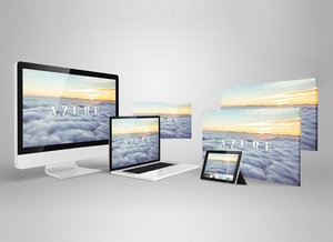
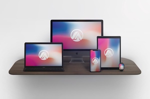
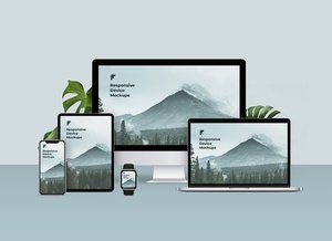
MacBook Pro 16? & iPhone 13 Pro Max Responsive Website Mockup

The internet is constantly evolving and the way we interact with it is constantly changing. One of the most important developments in web design over the past few years is the increasing focus on mobile-first web design. As people increasingly use their phones and tablets to access websites, designers must ensure that their sites are fluid and responsive, able to open on both larger and smaller screens. To make this process easier, designbolts have created a website mockup specifically designed to help developers present their designs and templates on both desktop and mobile devices. This mockup is easy to use, with smart layers that enable easy insertion of designs. It is available in a layered PSD format, with a resolution of 5000 x 3333 px, and can be used for both personal and commercial use. With this mockup, designers can ensure that their designs are optimized for a range of devices, future-proofing their websites for years to come.