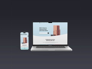
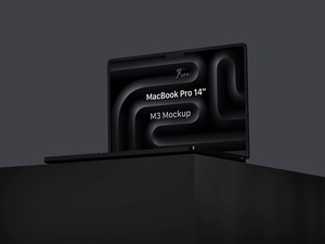
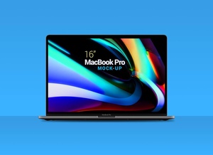
MacBook Pro & iPhone 13 Mockup
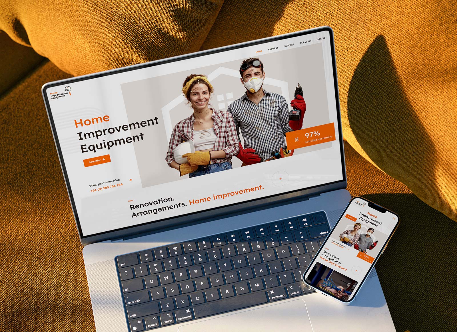
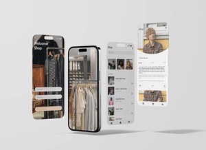
Responsive web design is essential for today's online experience, with more and more users accessing the internet via mobile devices. Google recommends this practice, as it enables websites to adjust their content and layout according to the size of the user's device. This way, visitors can more quickly and easily find the information they need, resulting in a smoother, more efficient user experience. To illustrate this, we are offering a free website mockup that consists of a MacBook Pro and an iPhone 13 in PSD format. Place your artwork on each screen to show off the responsiveness of your website. This mockup is smart-object ready and was created by Designbolts. Download it today to get started!