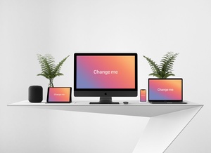
Apple Devices Responsive Website Screen Mockup

As web design and development becomes more complex, it is increasingly important to have high quality tools available to showcase the responsiveness of web designs. The freebie psd file offered here provides an excellent solution for presenting the responsiveness of web designs and templates. This file includes four different device screens: iPhone, iPad, MacBook and iMac. All of these device screens are compiled into the same psd file, making it easy to showcase the responsiveness of a web design on different devices.
The file offers a layered PSD format, so users can easily insert their web designs onto the device screens. Additionally, users can change the background color to compliment their theme design. This makes it easy to create a realistic and eye-catching presentation of a website or web template.
With these features, this freebie psd file is an excellent tool for web developers and designers. It is an easy to use and high quality psd file that helps make presenting web designs or templates easier than ever before.