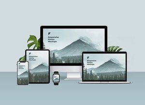



Responsive Web Design Template Mockup

The landscape of web design has undergone a profound transformation, shifting decisively towards a mobile-first philosophy. In today's interconnected world, web traffic predominantly originates from smaller screens rather than traditional desktop monitors. This significant paradigm shift mandates that web designers place their primary focus on optimizing user experiences across a diverse range of compact devices, including smartphones, tablets, and even smartwatches.
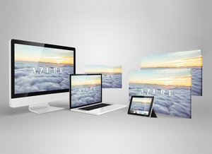
In response to this evolution, Responsive Web Design (RWD) has emerged as the definitive solution. RWD is an approach that ensures web pages render optimally across an array of devices by adapting their layout, images, and typography to fit the screen size and orientation. This adaptability creates a seamless and consistent user experience, regardless of how the content is accessed.
Gone are the days of fixed-pixel layouts. Modern web development embraces fluid grids and flexible units to ensure scalability. For vector graphics like icons, logos, and intricate shapes, SVG (Scalable Vector Graphics) has become the preferred format. SVGs retain perfect clarity and transparency at any resolution, their light file size contributes to faster load times, and their nature allows them to be embedded directly into HTML or CSS, making them highly efficient and easily renderable on any web page.
While PNGs once held a prominent position for transparent images, their usage has significantly dwindled. You might still encounter a PNG for a favicon, but for most web elements, more efficient alternatives are now available. For high-quality photographic content, WebP stands out as the superior choice. This next-generation image format offers dramatically smaller file sizes – often a fraction of their JPEG or PNG counterparts – without a discernible loss in visual quality. This exceptional compression ensures that image-heavy pages load almost instantaneously, contributing to a snappier user experience and improved search engine rankings.
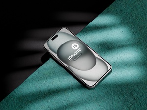
To assist designers in showcasing their responsive creations effectively, we are delighted to offer a high-quality responsive web design template mockup in PSD format. This meticulously crafted mockup allows you to effortlessly present your web designs in a professional and realistic context.
Key Features:
- Available Format: A fully layered PSD file, meticulously organized for easy customization.
- Smart Object Integration: Effortlessly place your artwork by simply inserting your designs onto the dedicated smart objects, guaranteeing a flawless and realistic outcome.
- License: Freely usable for both personal and commercial projects, offering maximum flexibility.
- File Inclusion: Your download includes a single, comprehensive Photoshop PSD File.
- Resolution: Presented in a stunning 4500 x 3000 px resolution, ensuring crisp details suitable for high-resolution displays and print.
- Instructions:
- Simply open the PSD file.
- Locate and double-click the smart object layers.
- Place your web design artwork within the smart object.
- Save and close the smart object to see your design instantly applied to the mockup.
- Compatibility: Requires Adobe Photoshop CS5 or a newer version to ensure full functionality.
Elevate your portfolio and impress clients by downloading this Responsive Website Mockup today and presenting your designs with unparalleled realism.