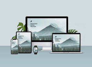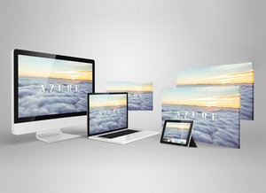


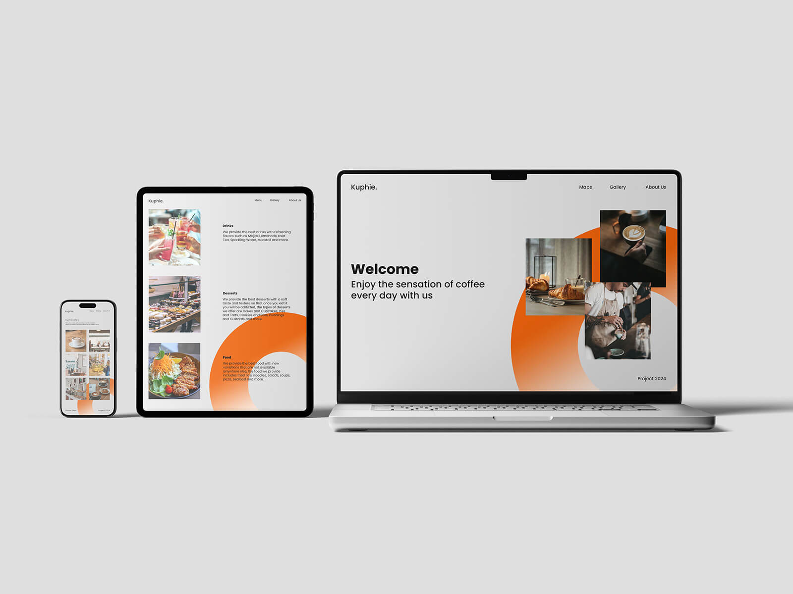
Multi-Device Responsive Web Design Mockup
Crafting Seamless User Experiences Through Responsive Web Design
For web designers, few things are as rewarding as witnessing the elegant transition of a website as it loads and seamlessly adapts to various device dimensions. The fundamental principle underlying fluid or responsive web design is its ability to conform to any screen size, irrespective of the device being used. This adaptive approach detects the browser's viewport dimensions, triggering the appropriate CSS styling to ensure optimal display.
In recent years, WebP image format has gained significant traction in the web design community. These images boast remarkably compact file sizes, resulting in faster-loading web pages. This advantage proves particularly valuable for portfolio websites, where visual content takes center stage and numerous high-quality images must load simultaneously when visitors land on the page. The reduced file size doesn't compromise quality, making WebP an ideal choice for image-heavy projects.
When it comes to logos and other design elements, vector-based graphics are the preferred solution, with SVG (Scalable Vector Graphics) format leading the way. SVG files offer exceptional versatility—designers can either embed the SVG file directly into the web page or integrate the SVG code inline within the HTML. Both methods ensure quick loading times and crisp rendering at any resolution, maintaining visual clarity across all devices from smartphones to large desktop monitors.
Multi-Device Responsive Web Design Mockup
This professional-grade mockup is presented in PSD format, designed to showcase your web projects across multiple devices simultaneously. The smart object functionality allows for effortless insertion of your artwork, producing photorealistic presentations that accurately represent how your designs will appear in real-world scenarios. Customization options include the ability to modify background colors and other elements to match your branding requirements.
Technical Specifications:
- File Format: Layered PSD with smart object insertion capability
- Usage Rights: Free for both personal and commercial projects
- Package Contents: High-resolution Photoshop PSD file
- Dimensions: 4500 x 3000 pixels
- Compatibility: Adobe Photoshop CS5 and newer versions
Implementation Guide:
- Open the PSD file in Adobe Photoshop
- Locate the smart object layers designated for your web designs
- Double-click the smart object to open it in a separate window
- Insert your website design screenshots or mockups
- Save and close the smart object window to see your designs applied to the mockup
- Adjust colors and other customizable elements as desired
- Export your final presentation-ready mockup
This mockup streamlines the process of presenting responsive web designs to clients or including them in your portfolio, demonstrating your work's adaptability across different screen sizes and devices in a single, cohesive visual presentation.