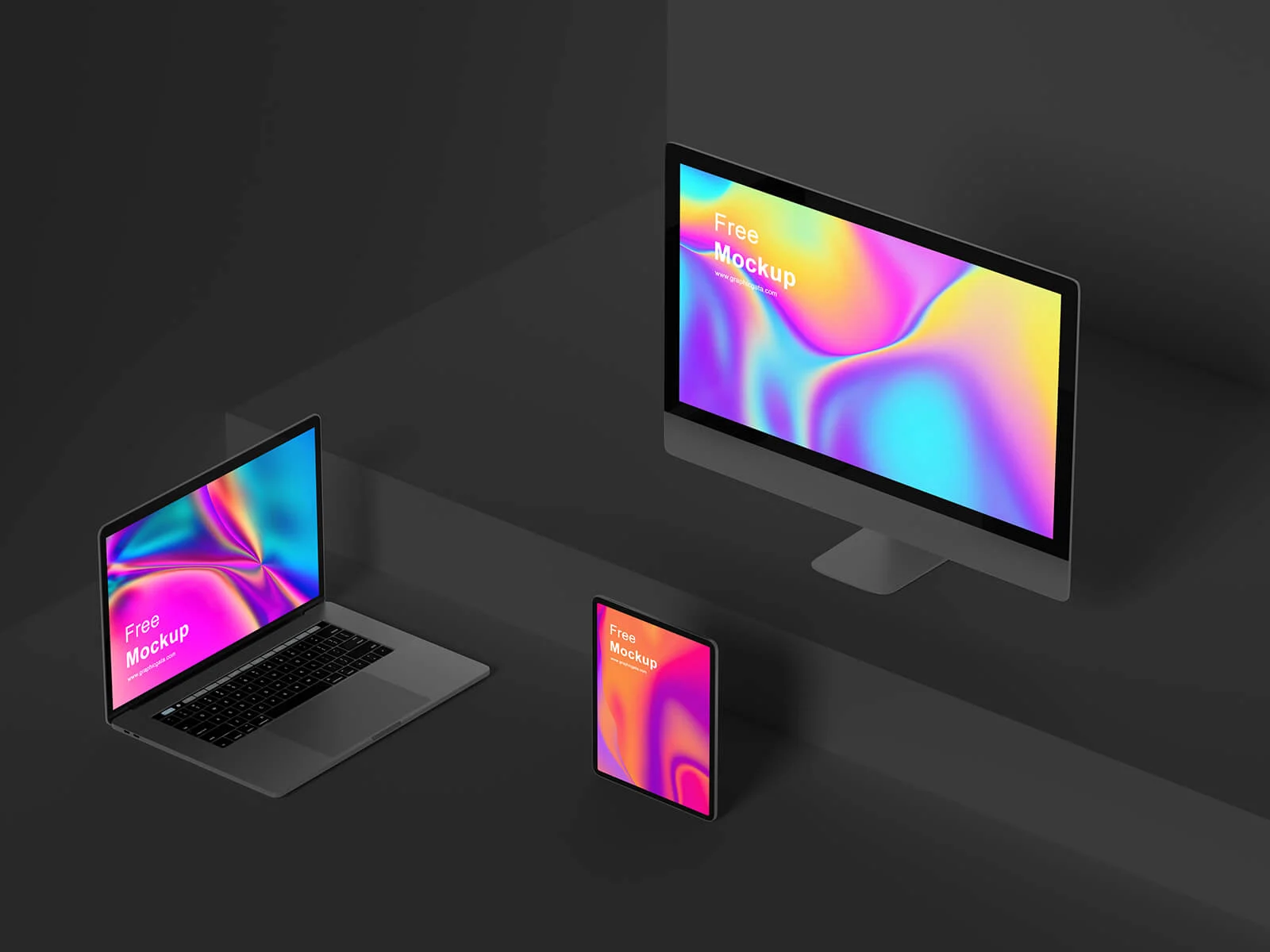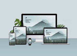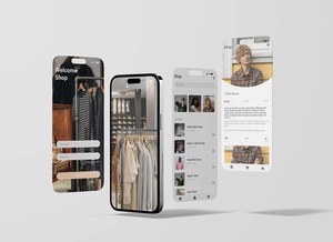






Isometric Apple Devices Responsive Website Mockup

In the contemporary digital landscape, a "mobile-first" philosophy has transitioned from a trend to an absolute necessity for any successful online presence. For specialized e-commerce platforms and independent brands, prioritizing mobile optimization is paramount. If your business model focuses on direct product sales rather than a broad marketplace structure, the speed and fluidity of your mobile shop can be the primary catalyst for increased traffic and, ultimately, higher conversion rates.
Consumer habits have undergone a radical shift. The days of users being tethered to a desk for prolonged browsing sessions are fading. Instead, the modern audience engages with content during "in-between" moments—while commuting, traveling, waiting in line, or even during a meal. This ubiquitous use of mobile devices demands a sophisticated approach to responsiveness.
Technical excellence is achieved when responsiveness is managed through dedicated CSS strategies. A well-engineered website should intelligently adapt to the user's environment: while a desktop version might leverage high-resolution, data-heavy assets to fill a large screen, the mobile counterpart must prioritize highly optimized resources to ensure instantaneous load times. This dual focus on performance and adaptability is not just a benefit for the user; it is a critical ranking factor for search engines, which prioritize lightning-fast, mobile-ready sites in their algorithms.
To help you showcase your latest responsive projects with professional flair, we are excited to offer a premium Isometric Apple Device Responsive Website Mockup set in PSD format. This toolkit allows you to project your artwork onto a realistic, multi-device environment, providing a tangible sense of how your website translates across different screen sizes.
Product Specifications: * Available Format: High-quality, layered PSD files featuring easy-to-use smart object insertion. * License: Free for both personal and commercial projects. * Package Contents: 3 distinct Photoshop PSD files. * Artwork Resolution: 4000 x 2680 pixels, ensuring crystal-clear presentation.
User Instructions: 1. Open the PSD file and locate the designated smart object layers. 2. Simply double-click the smart layer, place your design, and save to see a realistic outcome automatically generated. 3. Software Requirement: Adobe Photoshop CS5 or higher.
Download the Responsive Website Mockup Set today to elevate your design portfolio and demonstrate your commitment to a mobile-first world.